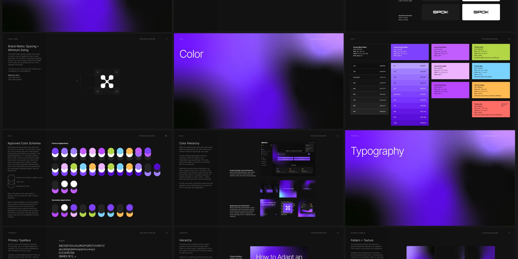
Spok is an AI marketing platform harnessing the latest advancements in generative technology. They needed a complete visual identity that separated it from the competitive landscape and lived harmoniously under parent brand Forum3—and alongside sister brand Hive3.
To create cohesion, we maintained typeface consistency amongst all brand identities, creating an analogous color palette and gradient system that mirrored the other identities. To differentiate itself in a saturated market, we examined the intersection of AI and its users, and discovered an interesting juxtaposition: the rigidity of technical processing and the fluidity of human thinking. To blend these concepts, we combined sharp, geometric forms with organic curves. The result was a suite of slightly amorphous, albeit angular brand marks.